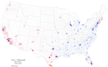
A dot distribution map (or a dot density map or simply a dot map) is a type of thematic map that uses a point symbol to visualize the geographic distribution of a large number of related phenomena. Dot maps are a type of unit visualizations that rely on a visual scatter to show spatial patterns, especially variances in density.[1][2] The dots may represent the actual locations of individual phenomena, or be randomly placed in aggregation districts to represent a number of individuals. Although these two procedures, and their underlying models, are very different, the general effect is the same.
- ^ Pearson Education, Inc. "Key Terms." Making Maps With GIS. Pearson Education, Inc. 8 December 2009. http://wps.prenhall.com/esm_clarke_gsgis_4/7/1848/473320.cw/index.html Archived 2010-01-01 at the Wayback Machine. 1 May 2010.
- ^ Allen, Jeff (2021-05-11). "Temporal transitions of demographic dot maps". International Journal of Cartography. 8 (2): 208–222. doi:10.1080/23729333.2021.1910184. ISSN 2372-9333. S2CID 236567004.