 | |
| Category | Sans-serif |
|---|---|
| Classification | Grotesque |
| Designer(s) | Morris Fuller Benton |
| Foundry | American Type Founders |
| Date released | 1902–1967 |
| Also known as | Gothic #1, Square Gothic Heavy, Gothic #16 |
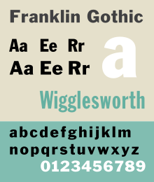
Franklin Gothic and its related faces are a large family of sans-serif typefaces in the industrial or grotesque style developed in the early years of the 20th century by the type foundry American Type Founders (ATF) and credited to its head designer Morris Fuller Benton.[1] "Gothic" was a contemporary term (now little-used except to describe period designs) meaning sans-serif.
Franklin Gothic has been used in many advertisements and headlines in newspapers. The typeface continues to maintain a high profile, appearing in a variety of media from books to billboards. Despite a period of eclipse in the 1930s, after the introduction of European faces like Kabel and Futura, they were re-discovered by American designers in the 1940s and have remained popular ever since. Benton's Franklin Gothic family is a set of solid designs, particularly suitable for display and trade use such as headlines rather than for extended text. Many versions and adaptations have been made since.
Probably the best-known extension of Franklin Gothic is Victor Caruso's 1970s ITC Franklin Gothic, which expands the series to include book weights similar to Benton's News Gothic in a high x-height 1970s style. It is in part bundled with Microsoft Windows.[2][3]
- ^ Shen, Juliet. "Searching for Morris Fuller Benton". Type Culture. Retrieved 11 April 2017.
- ^ "ITC Franklin Gothic". MyFonts. Retrieved 27 December 2017.
- ^ "Franklin Gothic". Microsoft. Retrieved 27 December 2017.