This article needs additional citations for verification. (May 2014) |

In graphic design, page layout is the arrangement of visual elements on a page. It generally involves organizational principles of composition to achieve specific communication objectives.[1]
The high-level page layout involves deciding on the overall arrangement of text and images, and possibly on the size or shape of the medium. It requires intelligence, sentience, and creativity, and is informed by culture, psychology, and what the document authors and editors wish to communicate and emphasize. Low-level pagination and typesetting are more mechanical processes. Given certain parameters such as boundaries of text areas, the typeface, and font size, justification preference can be done in a straightforward way. Until desktop publishing became dominant, these processes were still done by people, but in modern publishing, they are almost always automated. The result might be published as-is (as for a residential phone book interior) or might be tweaked by a graphic designer (as for a highly polished, expensive publication).
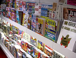
Beginning from early illuminated pages in hand-copied books of the Middle Ages and proceeding down to intricate modern magazine and catalog layouts, proper page design has long been a consideration in printed material. With print media, elements usually consist of type (text), images (pictures), and occasionally place-holder graphics for elements that are not printed with ink such as die/laser cutting, foil stamping or blind embossing.
The term page furniture may be used for items on a page other than the main text and images, such as headlines, bylines or image captions.[2]
- ^ O'Connor, Z (2014). Elements and principles of design: Tools for digital imagery, art and design.
- ^ Ribbans, Elisabeth (31 January 2023). "The perils of using journalist jargon outside the newsroom". The Guardian. Retrieved 25 June 2023.