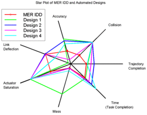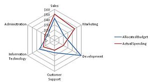

A radar chart is a graphical method of displaying multivariate data in the form of a two-dimensional chart of three or more quantitative variables represented on axes starting from the same point. The relative position and angle of the axes is typically uninformative, but various heuristics, such as algorithms that plot data as the maximal total area, can be applied to sort the variables (axes) into relative positions that reveal distinct correlations, trade-offs, and a multitude of other comparative measures.[1]
The radar chart is also known as web chart, spider chart, spider graph, spider web chart, star chart,[2] star plot, cobweb chart, irregular polygon, polar chart, or Kiviat diagram.[3][4] It is equivalent to a parallel coordinates plot, with the axes arranged radially.
- ^ Porter, Michael M; Niksiar, Pooya (2018). "Multidimensional mechanics: Performance mapping of natural biological systems using permutated radar charts". PLOS ONE. 13 (9): e0204309. Bibcode:2018PLoSO..1304309P. doi:10.1371/journal.pone.0204309. PMC 6161877. PMID 30265707.
- ^ Nancy R. Tague (2005) The quality toolbox. page 437.
- ^ Kolence, Kenneth W. (1973). "The Software Empiricist". ACM SIGMETRICS Performance Evaluation Review. 2 (2): 31–36. doi:10.1145/1113644.1113647. S2CID 18600391.
Dr. Philip J. Kiviat suggested at a recent NBS/ACM workshop on performance measurement that a circular graph, using radii as the variable axes might be a useful form. […] I recommend they be called "Kiviat Plots" or "Kiviat Graphs" to recognize his insight as to their importance.
- ^ "Find Content Gaps Using Radar Charts". Content Strategy Workshops. March 3, 2015. Retrieved December 17, 2015.