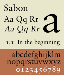
 | |
| Category | Serif |
|---|---|
| Classification | Old-style |
| Designer(s) | Jan Tschichold |
| Foundry | Monotype, Linotype, Stempel |
Sabon is an old-style serif typeface designed by the German-born typographer and designer Jan Tschichold (1902–1974) in the period 1964–1967.[1] It was released jointly by the Linotype, Monotype, and Stempel type foundries in 1967.[2] The design of the roman is based on types by Claude Garamond (c. 1480–1561), particularly a specimen printed by the Frankfurt printer Konrad Berner. Berner had married the widow of a fellow printer Jacques Sabon, the source of the face's name, who had bought some of Garamond's type after his death. The italics are based on types designed by a contemporary of Garamond's, Robert Granjon. It is effectively a Garamond revival, though a different name was chosen as many other modern typefaces already carry this name.
A classic typeface for body text, Sabon's longstanding popularity has transcended its origin as a commission to fit a tight set of business requirements. Tschichold was commissioned by a coalition of German printers to create a typeface that could be printed identically on Linotype, Monotype or letterpress equipment, simplifying the process of planning lines and pagination when printing a book. The italic and bold styles were to take up exactly as much space as the roman, a feature imposed by the duplexing system of Linotype hot metal typesetting machines of the period.[3][4][5] Finally, the new font was to be five per cent narrower than their existing Monotype Garamond, in order to save space and money.[6] Sabon's name was therefore considered appropriate: a Frenchman who had moved to Frankfurt, he had played a role in bringing Garamond's type into use in German printing four hundred years before.
- ^ Cite error: The named reference
Die Sabon von Jan Tschicholdwas invoked but never defined (see the help page). - ^ Cite error: The named reference
vishistwas invoked but never defined (see the help page). - ^ Haralambous, Yannis (2007). Fonts & Encodings (1st ed.). Sebastopol, Calif.: O'Reilly Media. pp. 377–381. ISBN 978-0-596-10242-5. Retrieved 13 December 2015.
- ^ Shaw, Paul (12 May 2011). "Flawed Typefaces". Print magazine. Retrieved 30 June 2015.
- ^ Haslam, Andrew; Baines, Phil (2005). Type & typography (2nd ed.). London: Laurence King. p. 99. ISBN 978-1-85669-437-7.
- ^ Cf. S. Garfield, Just My Type, p.251.