| Featured picture tools |
|---|
Please cut and paste new entries to the bottom of this page, creating a new monthly archive (by closing date) when necessary.
Voting period is over. Please don't add any new votes. Voting period ends on 1 Nov 2018 at 19:40:30 (UTC)

- Reason
- Clear diagrammatic explanation of the structure of a tropical cyclone. Compare to [1], [2] and [3]. Featured on Commons.
- Articles in which this image appears
- Tropical cyclone, Eye (cyclone)
- FP category for this image
- Wikipedia:Featured pictures/Sciences/Others
- Creator
- Kelvin13
- Support as nominator – MER-C 19:40, 22 October 2018 (UTC)
- Comment To be encyclopaedic, the diagram should not use the term hurricane. Charlesjsharp (talk) 22:05, 22 October 2018 (UTC)
- "hurricane" is used commonly in the articles. Bammesk (talk) 03:34, 23 October 2018 (UTC)
- Not in much of the pacific where typhoon or tropical cyclone are used. Charlesjsharp (talk) 07:48, 23 October 2018 (UTC)
- Yes there are other terms as well. "Hurricane" is used in above articles and elsewhere on Wikipedia, so I don't see it as a mistake or hindrance. Bammesk (talk) 02:22, 24 October 2018 (UTC)
- Support – EV. Bammesk (talk) 02:22, 24 October 2018 (UTC)
- Oppose Should be Tropical Cyclone, not hurricane, since this formation can occur in the Pacific. Mattximus (talk) 15:00, 27 October 2018 (UTC)
Not Promoted --Armbrust The Homunculus 22:02, 1 November 2018 (UTC)
Voting period is over. Please don't add any new votes. Voting period ends on 2 Nov 2018 at 03:06:36 (UTC)
- Reason
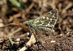
- High quality large image. FP on Commons.
- Articles in which this image appears
- Hesperia comma
- FP category for this image
- Wikipedia:Featured pictures/Animals/Insects
- Creator
- Charlesjsharp
- Support as nominator – The NMI User (talk) 03:06, 23 October 2018 (UTC)
- Oppose – sorry but busy composition, the main subject doesn't stand out. Bammesk (talk) 03:30, 23 October 2018 (UTC)
- Support. Renomination. Voters in previous nom were MER-C, ♪♫Al and Janke Charlesjsharp (talk) 07:52, 23 October 2018 (UTC)
- Oppose – I "skipped" it last time... Too messy composition for my taste, unfortunately. --Janke | Talk 08:14, 23 October 2018 (UTC)
- Oppose – Per Bammesk, Janke. Too jumbled. Sca (talk) 13:36, 23 October 2018 (UTC)
Not Promoted --Armbrust The Homunculus 06:18, 2 November 2018 (UTC)
Voting period is over. Please don't add any new votes. Voting period ends on 2 Nov 2018 at 02:58:27 (UTC)

- Reason
- Lead image for World War I casualties, featured on Commons
- Articles in which this image appears
- World War I casualties, British Army during World War I, Ernest Brooks (photographer)
- FP category for this image
- Wikipedia:Featured pictures/History/World War I
- Creator
- Ernest Brooks (photographer)
- Support as nominator – The NMI User (talk) 02:58, 23 October 2018 (UTC)
- Support as before. MER-C 06:37, 23 October 2018 (UTC)
- Furthermore it would be great to get this on the main page for 11 November (100 years since the end of World War I). MER-C 13:30, 23 October 2018 (UTC)
- Support. Good encyclopedic value, irreplacable historic photograph, decent quality. TSP (talk) 10:49, 23 October 2018 (UTC)
- Comment I suspect that this image would benefit from a crop which removes the coat on the right-hand side of the frame. Nick-D (talk) 05:23, 27 October 2018 (UTC)
Not Promoted --Armbrust The Homunculus 06:19, 2 November 2018 (UTC)
- Nomination didn’t reach the necessary quorum for promotion. Armbrust The Homunculus 06:19, 2 November 2018 (UTC)
Voting period is over. Please don't add any new votes. Voting period ends on 2 Nov 2018 at 13:14:48 (UTC)
- Reason
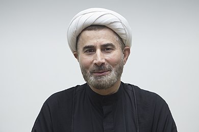
- Good quality and lighting. Article's only image where it replaced an inferior version.
- Articles in which this image appears
- Mansour Leghaei
- FP category for this image
- People
- Creator
- Muhammad Mahdi Karim
- Support as nominator – Muhammad(talk) 13:14, 23 October 2018 (UTC)
- I guess I'm not the only one returning to FPC after a long absence - welcome back! Anyway, you should be aware that the size limit is now 1500x1500. MER-C 13:21, 23 October 2018 (UTC)
- Thanks for the welcome and the heads up. I have uploaded a higher res version --Muhammad(talk) 13:32, 23 October 2018 (UTC)
- Oppose. --Gnosis (talk) 06:36, 24 October 2018 (UTC)
- Oppose not a great portrait. Lighting, background, sharpness, crop. Charlesjsharp (talk) 08:51, 24 October 2018 (UTC)
Not Promoted --Armbrust The Homunculus 13:15, 2 November 2018 (UTC)
Voting period is over. Please don't add any new votes. Voting period ends on 4 Nov 2018 at 18:43:15 (UTC)

- Reason
- Commons POTY finalist in 2015 with clear EV.
- Articles in which this image appears
- Lord Murugan Statue, God, Batu Caves, and others
- FP category for this image
- Wikipedia:Featured pictures/Artwork/Sculpture
- Creator
- Uwe Aranas
- Support as nominator – MER-C 18:43, 25 October 2018 (UTC)
- Support – Bammesk (talk) 00:46, 26 October 2018 (UTC)
- Comment – Main target article is a tiny stub. "God" as a target article is presumptuous to say the least. Sca (talk) 13:34, 26 October 2018 (UTC)
- Comment I agree. The image isn't even in the main box for the Batu caves article. Charlesjsharp (talk) 19:08, 26 October 2018 (UTC)
- Oppose. The perspective is really confusing and a makes estimating the statue's size difficult. --Paul_012 (talk) 08:54, 4 November 2018 (UTC)
Not Promoted --Armbrust The Homunculus 19:22, 4 November 2018 (UTC)
Voting period is over. Please don't add any new votes. Voting period ends on 6 Nov 2018 at 22:19:45 (UTC)

- Reason
- High quality large image. FP on Commons.
- Articles in which this image appears
- Common seal
- FP category for this image
- Wikipedia:Featured pictures/Animals/Mammals
- Creator
- Charlesjsharp
- Support as nominator – Charlesjsharp (talk) 22:19, 27 October 2018 (UTC)
- Support. Would prefer a tighter crop for use on Wikipedia, but otherwise looks great. Kaldari (talk) 21:07, 30 October 2018 (UTC)
- Support – Bammesk (talk) 00:17, 2 November 2018 (UTC)
- Support. MER-C 18:00, 2 November 2018 (UTC)
- Support. I'll take the fifth. --Janke | Talk 12:54, 4 November 2018 (UTC)
Promoted File:Common seal (Phoca vitulina) 2.jpg --Armbrust The Homunculus 22:20, 6 November 2018 (UTC)
Voting period is over. Please don't add any new votes. Voting period ends on 7 Nov 2018 at 04:59:19 (UTC)

- Reason
- Good quality for an astronomy photo, and is the lead image for the Eagle Nebula article
- Articles in which this image appears
- Eagle Nebula, Nebulae in fiction, Gum catalog, RCW Catalogue, Sharpless catalog, The Whole Shebang: A State-of-the-Universe(s) Report
- FP category for this image
- Wikipedia:Featured pictures/Space/Looking out
- Creator
- ESO
- Support as nominator – Pine✉ 04:59, 28 October 2018 (UTC)
- Support But too much information in the description. Much would be better done as notes on the image. Charlesjsharp (talk) 10:20, 28 October 2018 (UTC)
- Support – EV, looks a bit too noisy, but probably as good as it gets for years to come. Bammesk (talk) 00:33, 2 November 2018 (UTC)
- Support – Great EV. --Janke | Talk 12:53, 4 November 2018 (UTC)
- Support. While I feel that this image could do with a larger field of view, we can always replace it later. This is good enough. MER-C 14:05, 4 November 2018 (UTC)
Promoted File:Eagle Nebula from ESO.jpg --Armbrust The Homunculus 05:00, 7 November 2018 (UTC)
Voting period is over. Please don't add any new votes. Voting period ends on 7 Nov 2018 at 18:18:19 (UTC)
- Reason
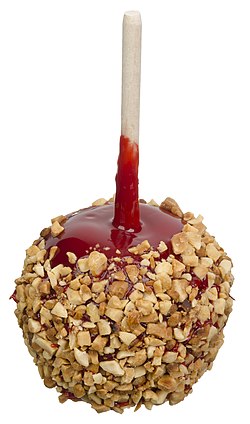
- Interesting subject taken by one of our FP suppliers.
- Articles in which this image appears
- Candy apple, Halloween
- FP category for this image
- Food and drink
- Creator
- Evan-Amos
- Support as nominator – Brandmeistertalk 18:18, 28 October 2018 (UTC)
- Comment – Meh. Sca (talk) 13:33, 29 October 2018 (UTC)
- Weak Oppose - Would prefer an image with a background rather than floating in space. Kaldari (talk) 21:04, 30 October 2018 (UTC)
- Would you mind answering why you think a white background isn't a background? 344917661X (talk) 01:46, 5 November 2018 (UTC)
- Comment and it's upside down. Charlesjsharp (talk) 09:08, 31 October 2018 (UTC)
- Charles, you notice everything! – Sca (talk) 12:40, 31 October 2018 (UTC)
- Support - Chris857 (talk) 15:59, 1 November 2018 (UTC)
- Support – agree with Kaldari about background or some shadow, but well done otherwise and EV. Bammesk (talk) 00:25, 2 November 2018 (UTC)
- Support I find the argument that an image needs to have a proper background in order to be promoted to FPS to be stupid, since the featured picture criteria does not say that an image requires a proper background in order to be promoted, and a white background is still a background nonetheless. The arguments above, including the one I mentioned before, are extremely nit-picky. 344917661X (talk) 02:37, 2 November 2018 (UTC)
- Support. I'm not a fan of the noise/artifacts on the shiny surface, but this is a fairly minor nitpick. MER-C 18:01, 2 November 2018 (UTC)
- Oppose – I would normally support, but it is upside-down... Candy apples are not eaten with the stick up. Mattximus (talk) 13:59, 3 November 2018 (UTC)
- I see it as how it is served [4] rather than eaten. Bammesk (talk) 14:59, 3 November 2018 (UTC)
- I agree with Bammesk. When Candy apples are on display, they are usually upside down, like the one in the image that has been nominated. 344917661X (talk) 19:17, 3 November 2018 (UTC)
- This would be less confusing if the image had a background. Then you could tell if it was being served or eaten or something else. Kaldari (talk) 02:16, 5 November 2018 (UTC)
Promoted File:Tastee-Candy-Apple-Red-Caramel-wPeanuts.jpg --Armbrust The Homunculus 21:28, 7 November 2018 (UTC)
Voting period is over. Please don't add any new votes. Voting period ends on 8 Nov 2018 at 20:56:57 (UTC)

- Reason
- High quality large image. FP on Commons. Essential for article.
- Articles in which this image appears
- Nilgai
- FP category for this image
- Wikipedia:Featured pictures/Animals/Mammals
- Creator
- Charlesjsharp
- Support as nominator – Charlesjsharp (talk) 20:56, 29 October 2018 (UTC)
- Support. MER-C 21:05, 29 October 2018 (UTC)
- Support – Bammesk (talk) 00:09, 2 November 2018 (UTC)
- Support – on EV grounds. Mattximus (talk) 14:02, 3 November 2018 (UTC)
- Support --Pine✉ 06:32, 6 November 2018 (UTC)
Promoted File:Nilgai (Boselaphus tragocamelus) male.jpg --Armbrust The Homunculus 21:28, 8 November 2018 (UTC)
Voting period is over. Please don't add any new votes. Voting period ends on 12 Nov 2018 at 18:09:18 (UTC)

- Reason
- High resolution, nearly unanimously featured on Commons, essential for article.
- Articles in which this image appears
- Bothrops bilineatus
- FP category for this image
- Wikipedia:Featured pictures/Animals/Reptiles
- Creator
- Renato Augusto Martins
- Support as nominator – MER-C 18:09, 2 November 2018 (UTC)
- Support – Arresting colors, fairly good detail. Sca (talk) 21:16, 2 November 2018 (UTC)
- Support – Not perfect, but I do think it has high EV. Mattximus (talk) 14:01, 3 November 2018 (UTC)
- Support – Bammesk (talk) 14:26, 3 November 2018 (UTC)
- Support Charlesjsharp (talk) 11:31, 4 November 2018 (UTC)
- Support - even though I get a feeling we see two snakes, the left one having bitten the head off the right one... ;-) --Janke | Talk 19:51, 5 November 2018 (UTC)
Promoted File:Cobra-papagaio - Bothrops bilineatus - Ilhéus - Bahia.jpg --Armbrust The Homunculus 18:10, 12 November 2018 (UTC)
Voting period is over. Please don't add any new votes. Voting period ends on 13 Nov 2018 at 13:24:31 (UTC)

- Reason
- Its a high quality and resolution image that has already been adjudged as a featured image in Wikipedia Commons.
- Articles in which this image appears
- Durga Puja, bh: दुर्गा पूजा
- FP category for this image
- Wikipedia:Featured pictures/Artwork/Sculpture
- Creator
- Subhrajyoti07
- Support as nominator – Subhrajyoti07 (talk) 13:24, 3 November 2018 (UTC)
- Comment I'm not sure about the EV. The article is for a festival, but this seems to be some sculptures? I don't see the connection. Shouldn't an image about a festival contain people? Mattximus (talk) 14:00, 3 November 2018 (UTC)
- Comment Durga Puja celebrates the mythology of Goddess Durga (at the center) killing the demon (asura - at her feet) after a fierce battle. Every Puja or Pandal has a central theme which is these sculptures. People come to visit these locations to primarily see these sculptures and other associated decorations. This is the centerpiece of attraction. - Subhrajyoti07 (talk) 14:18, 3 November 2018 (UTC)
- Comment – about the EV, article's lead paragraph says "festival that features elaborate temple and stage decorations", there is also a section on "Decorations: sculptures and stages" in the article [5]. The section says sculptures are made of clay and then painted (specifically and annually for each festival it seems), and it's a "ceremonial process". Is this a clay sculpture?! It doesn't look like one! Also, perhaps this image could have good EV in the Murti article. Bammesk (talk) 14:44, 3 November 2018 (UTC)
- Comment – Predominantly clay is used in creating these sculptures. However these days artists are using other mediums such as fiber glass, paper etc as well. This particular one I believe is made of clay and then painted in the shiny golden colour. These sculptures and the housings inside which they are created are put up for about 10 days of celebration. After the 10th day (called dashami) the idols are immersed in local waterbodies - called "bisarjan". So every year they get created and then gets taken apart.- Subhrajyoti07 (talk) 15:05, 3 November 2018 (UTC)
- Support – making and display of these sculptures seem to be a big part of the festival, so I am Ok with it. But adding the image to other related articles can improve its encyclopedic value, for example [6], [7] or similar articles. Bammesk (talk) 15:28, 3 November 2018 (UTC)
- Comment – Done - Subhrajyoti07 (talk) 16:26, 3 November 2018 (UTC)
- Comment. Are the backing of the statues meant to be not upright? The bottom right hanging charm is slightly cut off. I'm quite surprised these issues weren't picked up on Commons, but as this image was rather hard to take I won't oppose. MER-C 12:02, 5 November 2018 (UTC)
- Comment - The original image had the entire bottom right hanging decoration which somehow got cropped out in subsequent versions. I have re-uploaded the image to include the same in totality. However I am not sure if I am able to follow you about the backing of the statues not being upright.- Subhrajyoti07 talk 16:12, 5 November 2018 (UTC)
- Draw a vertical line downwards in your favorite image editing program on the edges of all backing boards (or zoom in, and align one with the edge of your screen). The question is: are the statues actually like this in the real world, or does the photo need some kind of tilt and perspective correction? It seems better in the newer version, but the problem, if there is a problem, is more than just a mere tilt. MER-C 19:05, 5 November 2018 (UTC)
- The statues look nicely upright so I don't see a need for perspective correction. About the back panels: I think that's how they just are, the construction doesn't necessarily follow architectural precision or alignment, there are 3 separate base pedestals, and the 2 left statues and the 2 right statues face sideways a bit more than if the whole thing was constructed with a two dimensional flat perspective in mind. Just my 2 cents :) Bammesk (talk) 01:03, 6 November 2018 (UTC)
- I think this is how the original set up was actually done. Trying to compensate it through manual lens correction will play foul with the front sculptures, which is the main focus of the image. - Subhrajyoti07 talk 03:55, 6 November 2018 (UTC)
- Support as my objections have been satisfactorily addressed. MER-C 09:31, 6 November 2018 (UTC)
Not Promoted --Armbrust The Homunculus 13:40, 13 November 2018 (UTC)
- Nomination didn’t reach the necessary quorum for promotion. Armbrust The Homunculus 13:40, 13 November 2018 (UTC)
Voting period is over. Please don't add any new votes. Voting period ends on 15 Nov 2018 at 04:17:46 (UTC)


- Reason
- Renowned historical monument, captures the atmosphere of the place, good resolution and EV
- Articles in which this image appears
- Boston Public Library, McKim Building, Boston Public Library
- FP category for this image
- Wikipedia:Featured pictures/Places/Interiors
- Creator
- Hari Krishnan
- Support as nominator – Hari Krishnan 04:17, 5 November 2018 (UTC)
- Comment Dizzying perspective... Should either have been shot with a tilt-shift lens or been perspective-corrected in software. --Janke | Talk 07:12, 5 November 2018 (UTC)
- Oppose
Not used in any articles.MER-C 10:13, 5 November 2018 (UTC)- I still oppose this nomination for the noise. MER-C 09:32, 6 November 2018 (UTC)
- Comment Image added to articles. Hari Krishnan 12:05, 5 November 2018 (UTC)
- Oppose – Looks tilty and out of whack perspective-wise, perhaps because symmetrical tableau was shot a bit off-center. Sca (talk) 14:40, 5 November 2018 (UTC)
- Comment - Perspective corrected, uploaded over original. Revert if you don't like it. --Janke | Talk 16:46, 5 November 2018 (UTC)
- Thank you for correcting perspective. Hari Krishnan 19:15, 5 November 2018 (UTC) — Preceding unsigned comment added by 198.89.66.135 (talk)
SupportGreat image, portrays the subdued dynamism inside a library, good colors, proper lighting, perspective correction looks good, good EV. Kalart 22:33, 5 November 2018 (UTC)- Struck !vote because the user doesn't meet the requirements. (Account wasn't registered 25 days ago and it didn't make 100 edits.) Armbrust The Homunculus 02:13, 6 November 2018 (UTC)
- Oppose Quality is nothing like the current standard for interiors on Commons. Ceiling all grainy. Charlesjsharp (talk) 23:06, 5 November 2018 (UTC)
- Support alternate – I added an alternate edited version (denoised and pulled up the levels of darker areas). Pinging those who voted @Hari Krishnan, Janke, MER-C, Sca, and Charlesjsharp:. Alternate image is a bit softer but still has good detail at full size. Bammesk (talk) 14:08, 10 November 2018 (UTC)
- I think the alternative, while an improvement, is too soft to meet current standards. MER-C 21:38, 10 November 2018 (UTC)
Not Promoted --Armbrust The Homunculus 04:18, 15 November 2018 (UTC)
Voting period is over. Please don't add any new votes. Voting period ends on 16 Nov 2018 at 06:36:52 (UTC)

- Reason
- Good EV
- Articles in which this image appears
- Paxton's Tower
- FP category for this image
- Wikipedia:Featured pictures/Places/Architecture
- Creator
- Mattofaberystwyth, edited by Pine
- Support as nominator – Pine✉ 06:36, 6 November 2018 (UTC)
- Support Looks good to me, great EV. Mattximus (talk) 23:52, 8 November 2018 (UTC)
- Support. MER-C 09:29, 9 November 2018 (UTC)
- Weak oppose – the shadow size on the front face is too large. An image like this would be an improvement. Bammesk (talk) 14:18, 10 November 2018 (UTC)
Not Promoted --Armbrust The Homunculus 13:00, 16 November 2018 (UTC)
Voting period is over. Please don't add any new votes. Voting period ends on 16 Nov 2018 at 06:53:26 (UTC)

- Reason
- Good image quality, already featured Commons, and used in several articles. It looks like User:Saffron Blaze started to nominate this photo but may not have transcluded the nomination because it expired without votes other than his/her own. There is another photo of the tower which is already featured, and I think that having them both be featured is okay.
- Articles in which this image appears
- Broadway Tower, Worcestershire, Folly, Worcestershire, Cotswold Way, James Wyatt, Thomas Phillipps, Architecture of the United Kingdom
- FP category for this image
- Wikipedia:Featured pictures/Places/Architecture
- Creator
- Saffron Blaze
- Support as nominator – Pine✉ 06:53, 6 November 2018 (UTC)
- Comment: Another (properly transcluded) previous nom is at Wikipedia:Featured picture candidates/File:Broadway Tower 2012.jpg. --Paul_012 (talk) 13:34, 6 November 2018 (UTC)
- Oppose – Overly extensive surrounding space that lacks visual information. Sca (talk) 15:06, 6 November 2018 (UTC)
- Comment – per Paul we have an existing FP [8]. The nom image has more detail, I would support a delist and replace. Bammesk (talk) 00:58, 7 November 2018 (UTC)
- I would also support a crop and the replacement of the existing image. MER-C 17:16, 7 November 2018 (UTC)
- Oppose Because we already have a featured image of this building. I believe for EV purposes we are to have only 1 picture nominated per subject. Mattximus (talk) 23:28, 7 November 2018 (UTC)
Not Promoted --Armbrust The Homunculus 13:00, 16 November 2018 (UTC)
Voting period is over. Please don't add any new votes. Voting period ends on 16 Nov 2018 at 10:11:23 (UTC)

- Reason
- Highly detailed panorama of this World Heritage site. Featured on Commons.
- Articles in which this image appears
- Persepolis, History of Iran
- FP category for this image
- link to category (listed on the WP:FP page) that best describes the image
- Creator
- Diego Delso
- Support as nominator – MER-C 10:11, 6 November 2018 (UTC)
- Oppose – Horizon bent & tilted, looks very weird. Could perhaps be fixed (but only from original RAW images, per author's request). --Janke | Talk 10:51, 6 November 2018 (UTC)
- Oppose – Per Janke. Sca (talk) 15:03, 6 November 2018 (UTC)
- Support. A beautiful Panoramic picture. Gnosis (talk) 20:36, 12 November 2018 (UTC)
- Support Freshman404Talk 06:38, 13 November 2018 (UTC)
Not Promoted --Armbrust The Homunculus 13:01, 16 November 2018 (UTC)
Voting period is over. Please don't add any new votes. Voting period ends on 16 Nov 2018 at 23:11:15 (UTC)

- Reason
- High quality large image. FP on Commons. Important for article
- Articles in which this image appears
- Stellagama
- FP category for this image
- Wikipedia:Featured pictures/Animals/Reptiles
- Creator
- Charlesjsharp
- Support as nominator – Charlesjsharp (talk) 23:11, 6 November 2018 (UTC)
- Support, sharp image, good composition, good EV. Kaldari (talk) 07:23, 7 November 2018 (UTC)
- Support. MER-C 16:58, 7 November 2018 (UTC)
- Support - Excellent EV, and great quality shot. Mattximus (talk) 23:51, 8 November 2018 (UTC)
- Support - The NMI User (talk) 02:15, 13 November 2018 (UTC)
Promoted File:Roughtail rock agama (Stellagama stellio brachydactyla).jpg --Armbrust The Homunculus 03:43, 17 November 2018 (UTC)
Voting period is over. Please don't add any new votes. Voting period ends on 17 Nov 2018 at 01:55:32 (UTC)

- Reason
- High resolution macro image, good composition, cleanly isolated from background
- Articles in which this image appears
- Phidippus otiosus
- FP category for this image
- Wikipedia:Featured pictures/Animals/Arachnids
- Creator
- David E. Hill
- Support as nominator – Kaldari (talk) 01:55, 7 November 2018 (UTC)
- Oppose Not enough general sharpness/definition and poor DoF. Quality possibly limited by camera. Line top left (scale?) doesn't work for me. Charlesjsharp (talk) 12:40, 7 November 2018 (UTC)
- @Charlesjsharp: Although this looks a bit like a tarantula, it's actually a tiny jumping spider (about the size of a house fly). With a macro photo of something so small it isn't possible to have both better sharpness and DoF (due to diffraction softening). f/11 (the aperture setting that was used) is right in the sweet spot for an SLR sensor. If you pushed it to f/16 (for more DoF) it would be diffraction limited and start looking soft. Personally, I think the photographer made a good trade-off between DoF and sharpness as most of the spider is in focus, especially the part closest to the viewer. Kaldari (talk) 17:31, 7 November 2018 (UTC)
- Looking at your user page, it looks like you probably already know everything I wrote above. Do you know of any way you could improve both the sharpness and DoF (as I don't). Kaldari (talk) 17:49, 7 November 2018 (UTC)
- It's not possible to get an FP of a tiny insect with a normal macro lens. I've photographed dozens but no FPs. The settings are fine otherwise. The secret is focus stacking or specialist camera equipment. Charlesjsharp (talk) 17:53, 7 November 2018 (UTC)
Not Promoted --Armbrust The Homunculus 03:54, 17 November 2018 (UTC)
Voting period is over. Please don't add any new votes. Voting period ends on 18 Nov 2018 at 21:34:19 (UTC)

- Reason
- Very high EV, good quality bellows macro photo (no DOF problem), shows even the minuscule LED chips and gold bonding wires inside the tiny 1.6 x 0.8 mm transparent surface-mount packages. Also shows a wider image of the matrix, as well as LEDs in their own light.
- Articles in which this image appears
- Light-emitting diode, Surface-mount technology
- FP category for this image
- materials science
- Creator
- Janke
- Support as nominator – Janke | Talk 21:34, 8 November 2018 (UTC)
- Support – Bammesk (talk) 01:03, 9 November 2018 (UTC)
- Support. MER-C 09:30, 9 November 2018 (UTC)
- Support - The NMI User (talk) 02:15, 13 November 2018 (UTC)
Not Promoted --Armbrust The Homunculus 23:19, 18 November 2018 (UTC)
- Nomination didn’t reach the necessary quorum for promotion. Armbrust The Homunculus 23:19, 18 November 2018 (UTC)
Voting period is over. Please don't add any new votes. Voting period ends on 18 Nov 2018 at 22:13:17 (UTC)
- Reason
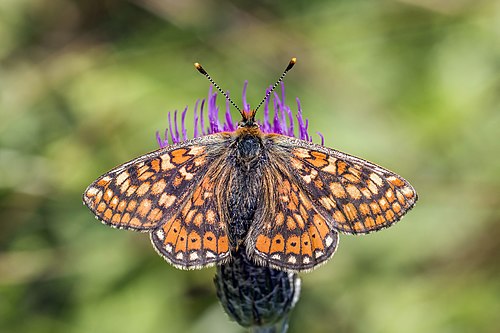
- High quality large image. FP on Commons. Illustrates article well.
- Articles in which this image appears
- Marsh fritillary
- FP category for this image
- Wikipedia:Featured pictures/Animals/Insects
- Creator
- Charlesjsharp
- Support as nominator – Charlesjsharp (talk) 22:13, 8 November 2018 (UTC)
- Support. I would also consider supporting this image as a set with File:Marsh fritillary (Euphydryas aurinia) female underside.jpg, or the two images with all subspecies. MER-C 15:22, 9 November 2018 (UTC)
- Support. Nice shot! --Janke | Talk 10:59, 10 November 2018 (UTC)
- Are fritillaries known for their fertility? – (Sorry!) Sca (talk) 14:31, 10 November 2018 (UTC)
- No way, they do not breed readily! Charlesjsharp (talk) 17:30, 10 November 2018 (UTC)
- Congrats on this quickly approved TFP. – Sca (talk) 14:04, 12 November 2018 (UTC)
- Are fritillaries known for their fertility? – (Sorry!) Sca (talk) 14:31, 10 November 2018 (UTC)
- Support - The NMI User (talk) 02:15, 13 November 2018 (UTC)
- Oppose – there are better images in the article. Bammesk (talk) 19:34, 18 November 2018 (UTC)
Not Promoted --Armbrust The Homunculus 23:21, 18 November 2018 (UTC)
Voting period is over. Please don't add any new votes. Voting period ends on 19 Nov 2018 at 15:01:49 (UTC)

- Reason
- High quality reproduction of a painting with its own article and significant impact elsewhere.
- Articles in which this image appears
- The Alchemist Discovering Phosphorus, Philosopher's stone, History of pseudoscience, etc.
- FP category for this image
- Wikipedia:Featured pictures/Artwork/Paintings
- Creator
- Joseph Wright of Derby
- Support as nominator – MER-C 15:01, 9 November 2018 (UTC)
- Question Looking at other versions online, this one looks too dark. Have you seen the picture in real life? 09:29, 11 November 2018 (UTC) Charlesjsharp (talk) 18:51, 11 November 2018 (UTC)
- No, but I found this photograph of the painting as it is displayed (bottom right), which would suggest the painting is darker than some direct photographs on the web. The artist is famous for chiaroscuro, so some darkness is expected. MER-C 20:29, 11 November 2018 (UTC)
- I think yours is darker than the one you signpost. Charlesjsharp (talk) 15:33, 12 November 2018 (UTC)
- I no longer live near Derby but I am very familiar with this painting and it is dark, dark and dark again hence the dramatic effect of the lit faces (chiaroscuro indeed and a master - if the photo doesn't show this it has failed).Look at his other paintings, once he got the trick he kept it.The museum lecture photo doesn't help.It looks overlit. Wright himself would, I am sure, have chosen this present version. Subjective support from me then. Notafly (talk) 20:08, 17 November 2018 (UTC) Ps.
Not Promoted --Armbrust The Homunculus 16:13, 19 November 2018 (UTC)
Voting period is over. Please don't add any new votes. Voting period ends on 23 Nov 2018 at 02:24:50 (UTC)

- Reason
- High resolution, this image appears on two articles
- Articles in which this image appears
- NGC 7635, List of Hubble anniversary images
- FP category for this image
- Wikipedia:Featured pictures/Space/Looking out
- Creator
- NASA, ESA, Hubble Heritage Team
- Support as nominator – The NMI User (talk) 02:24, 13 November 2018 (UTC)
- support Beautiful :) Freshman404Talk 06:41, 13 November 2018 (UTC)
- The caption needs to state that this is not an approximate true color image both here and in the article. Spectral line imaging has encyclopedic and scientific value, but you need to explain this specifically. (The noise is a result of the intentionally narrow bandpass, thus reducing the signal to noise ratio). MER-C 09:52, 13 November 2018 (UTC)
Not Promoted --Armbrust The Homunculus 05:39, 23 November 2018 (UTC)
- Nomination didn’t reach the necessary quorum for promotion. Armbrust The Homunculus 05:39, 23 November 2018 (UTC)
Voting period is over. Please don't add any new votes. Voting period ends on 23 Nov 2018 at 02:48:15 (UTC)
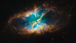
- Reason
- High resolution, this image appears in two articles on the English Wikipedia
- Articles in which this image appears
- NGC 2818, Pyxis
- FP category for this image
- Wikipedia:Featured pictures/Space/Looking out
- Creator
- NASA, ESA, and the Hubble Heritage Team (STScI/AURA)
- Support as nominator – The NMI User (talk) 02:48, 13 November 2018 (UTC)
- Support Freshman404Talk 06:41, 13 November 2018 (UTC)
- Oppose. Doesn't meet size requirements. MER-C 09:36, 13 November 2018 (UTC)
Not Promoted --Armbrust The Homunculus 05:39, 23 November 2018 (UTC)
Voting period is over. Please don't add any new votes. Voting period ends on 23 Nov 2018 at 02:58:09 (UTC)
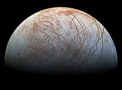

- Reason
- High resolution, FP on Commons, good EV
- Articles in which this image appears
- Europa (moon), Galileo (spacecraft), etc.
- FP category for this image
- Wikipedia:Featured pictures/Space/Looking out
- Creator
- NASA / Jet Propulsion Lab-Caltech / SETI Institute, uploaded by WolfmanSF
- Support as nominator – The NMI User (talk) 02:58, 13 November 2018 (UTC)
- Oppose – upsampled. I would support an upload from the original TIFF (second revision of this file). MER-C 09:36, 13 November 2018 (UTC)
- Support alternative – I have uploaded the said revision, which has not undergone additional upsampling and sharpening. MER-C 13:11, 13 November 2018 (UTC)
- Support as uploader – It was upsampled because the image's fine detail is difficult to appreciate in the smaller version (without putting your nose up to the monitor, that is – check out, for example, the ridges near the terminator). An image such as this would have gone through many types of processing and manipulation before being released, so the suggestion that we shouldn't edit it further makes little sense. WolfmanSF (talk) 20:28, 14 November 2018 (UTC)
- Support both, prefer Alternate 1. Whichever is stable in the article is Ok with me. Bammesk (talk) 02:06, 15 November 2018 (UTC)
- Oppose upsampled image, support Alternate 1 - nice image, doesn't need to be upsampled. Kaldari (talk) 23:15, 15 November 2018 (UTC)
- Support Alt. --Janke | Talk 10:05, 21 November 2018 (UTC)
Promoted File:PIA19048 realistic color Europa mosaic (alt).jpg --Armbrust The Homunculus 05:45, 23 November 2018 (UTC)
- Only "alt 1" has enough support for promotion. Armbrust The Homunculus 05:45, 23 November 2018 (UTC)
Voting period is over. Please don't add any new votes. Voting period ends on 24 Nov 2018 at 10:54:22 (UTC)


- Reason
- This crop of File:Julia Shaw 2018-03-10.jpg is the lead image in the article Julia Shaw (psychologist). The original image has been released through the OTRS and is of a high quality, so I believe this meets the FP criteria.
- Articles in which this image appears
- Julia Shaw (psychologist)
- FP category for this image
- People/Science and engineering
- Creator
- Boris Breuer; cropped by Kmhkmh
- Support as nominator – A Thousand Doors (talk | contribs) 10:54, 14 November 2018 (UTC)
- Comment The crop is uneven, her right shoulder is chopped off. Brandmeistertalk 11:48, 14 November 2018 (UTC)
- Perhaps a more even crop could be extracted from the original image (I wouldn't really know how to do that well enough). A Thousand Doors (talk | contribs) 12:45, 14 November 2018 (UTC)
- Personally I prefer a cropped version including the completely hair, but tastes differ. I can create another crop including both shoulders, if that is of any concern. My goal is/was simply to provide a better thumbbnail of her face (in the associated articles I created). The crop is basically just a cut & paste job with Gimp. I have no real opinion on the nomination. Personally if anything I'd rather nominate the original rather than this crop or similar derivatives. But i'm not familiar with the nomination criteria or goals.--Kmhkmh (talk) 16:40, 14 November 2018 (UTC)
- I added the original. It will be considered alongside the crop. That said, I agree with Brandmeister's point. MER-C 20:12, 14 November 2018 (UTC)
- I added Alternate 2a, a temporary crop (CSS image crop). If it gets enough support then a permanent crop can be uploaded by the nominator or Kmhkmh. Support Alternate 2a or other similar crops. Bammesk (talk) 02:32, 15 November 2018 (UTC)
- That's fine as crop for commons, for the wikipedia articles however I prefer picture that focuses more on the face, which is more common/useful for biographic article imho. So in this case only the torso above her hands.--Kmhkmh (talk) 05:17, 15 November 2018 (UTC)
- I edited the CSS crop to that extent. Revert if undesired. MER-C 10:19, 15 November 2018 (UTC)
- I didn't see that in time, meanwhile I've aleady replaced the pictures in the articles by another crop more or less the same as yours.--Kmhkmh (talk) 15:44, 15 November 2018 (UTC)
- I edited the CSS crop to that extent. Revert if undesired. MER-C 10:19, 15 November 2018 (UTC)
- Support alternative 2 (File:Julia Shaw 2018-03-10 cropped.jpg). MER-C 16:28, 15 November 2018 (UTC)
- I also support alternative 2a. MER-C 16:27, 22 November 2018 (UTC)

- Support alternative 2, but would also support the rest of the body. Brandmeistertalk 10:11, 16 November 2018 (UTC)
- Am I the only one who would support the original image if the right half was cropped only? Mattximus (talk) 14:57, 17 November 2018 (UTC)
- No you are not, that's what I proposed in this diff as Alternate 2, now labeled Alternate 2a. That's my preference. I have a hard time supporting the recent crops, they are too tight and look like a passport photo. Biography infoboxes can and do have full body and half body photos. Bammesk (talk) 15:51, 17 November 2018 (UTC)
- You lost me there. The criticism above concerns Alternative 2, if I understand that correctly and the recent crops are pretty much identical to alternative 2.--Kmhkmh (talk) 13:35, 18 November 2018 (UTC)
- I re-added the original Alternative 2, per this diff, now labeled Alternative 2a. And updated my posts above accordingly. Bammesk (talk) 15:08, 18 November 2018 (UTC)
- You lost me there. The criticism above concerns Alternative 2, if I understand that correctly and the recent crops are pretty much identical to alternative 2.--Kmhkmh (talk) 13:35, 18 November 2018 (UTC)
- I really disagree on that one. Headshots are a better choice as a first the first picture in a biographic article or for its infobox as it is all about visual recognition, which clearly gets impaired with half or full body pictures in thumbnail size. The latter are better suited as a second picture later on in the article. The fact that many articles may not use a headshot or something close to a it (yet) is imho simply due to the fact that at the time no better image was available (and the author may not have known hot to creae a crop or the quality of the image was insifficient for a decent crop).
- In any case I don't care much in term of the nomination, but I really object to switching the image in the articles on Julia Shaw to a full torso picture in thumbnail size.--Kmhkmh (talk) 13:30, 18 November 2018 (UTC)
Not Promoted --Armbrust The Homunculus 21:03, 24 November 2018 (UTC)
- None of the images has enough support for promotion. Armbrust The Homunculus 21:03, 24 November 2018 (UTC)
Voting period is over. Please don't add any new votes. Voting period ends on 25 Nov 2018 at 20:08:02 (UTC)

 |
 |
 |
 |
 |
 |
 |
 |
 |
 |
 |
 |
 |
 |
 |
 |
 |
 |
 | |
- Reason
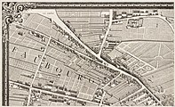
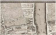
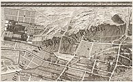
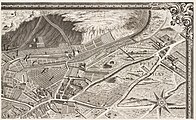
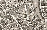
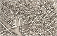
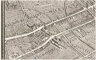
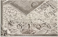
- Highly detailed reproduction of this historic map. Featured on Commons. This is a set nomination. The full image and all 20 individual plates above (20 images altogether) are all nominated.
- Articles in which this image appears
- Turgot map of Paris
- FP category for this image
- Wikipedia:Featured pictures/Diagrams, drawings, and maps/Maps
- Creator
- Michel-Étienne Turgot
- Support as nominator – MER-C 20:08, 15 November 2018 (UTC)
- Oppose – Not visually accessible to Main Page readers. Useful as a historical document only. Sca (talk) 14:48, 16 November 2018 (UTC)
- Support – Bammesk (talk) 16:48, 17 November 2018 (UTC)
- Support – great work, and already spawning derivatives that add to a range of articles (e.g. Place Dauphine, Louvre Palace). I'm sure intelligent editors can find a way to feature it on the Main Page - any one of these sheets would be featurable. TSP (talk) 15:28, 21 November 2018 (UTC)
- Support High quality scan of a work that is notable in its own right. I'm sure it can't be all that complicated to figure out how to display it on the main page. GMGtalk 15:32, 21 November 2018 (UTC)
Not Promoted --Armbrust The Homunculus 20:44, 25 November 2018 (UTC)
Voting period is over. Please don't add any new votes. Voting period ends on 5 Dec 2018 at 21:56:51 (UTC)

- Reason
- I've been working on retouching this on and off for the past few months. Couple things to point out. First, her hair is a little stringy, so if you zoom in close, I've fixed some things that were obvious scratches or dust marks, but I've left a lot of it because it's hard to tell that it isn't actually her hair. Same thing with the dress. Pretty sure it's velvet or something and that a good portion of the noise there was actually there, because I'm not sure lint brushes were a thing in ~1910.Other than that, this is a pretty rare find. She went on to become one of the foremost women academics of the early 20th century, but this was basically a period posed glamour shot of her before she really meant anything to anybody. The book really gives it away, since of course that's what she would choose for her prop. It was most likely 1909-1914, because she still has her wedding band on, and her husband died in 1914, although she really didn't rise to fame until after his death. All in all, really a high quality scan of a remarkably preserved image, of a remarkable person, from before anyone knew how remarkable she was.
- Articles in which this image appears
- Aurelia Henry Reinhardt
- FP category for this image
- Wikipedia:Featured pictures/People/Others
- Creator
- George Grantham Bain Collection, retouched by GreenMeansGo
- Support as nominator – GMGtalk 21:56, 25 November 2018 (UTC)
- Comment – Very nice restoration. Areas close to the mid-left border and lower-right border can use some more cleanup. I would support if that's done. Bammesk (talk) 01:35, 27 November 2018 (UTC)
- There's some weird hair-like patterns on her dress which ideally would be removed - they cross wrinkles and other hings in ways that indicate them to be on the print. I've noticed darker areas seem prone to be "sticky" in past restorations, collecting a lot more dust and fluff. I could potentially accept that given the high resolution. More problematic is the left hand side of the book, which looks very odd to me, like it's been blurred. It was not like that in the original. Reluctant weak oppose Adam Cuerden (talk) 02:23, 27 November 2018 (UTC)
- Agree with the book blur :-) (ghost from the past!!) Bammesk (talk) 02:56, 27 November 2018 (UTC)
- Hmm... probably withdraw this for now and spend some time working on the feedback. GMGtalk 20:08, 27 November 2018 (UTC)
Not Promoted --Armbrust The Homunculus 22:04, 27 November 2018 (UTC)
Voting period is over. Please don't add any new votes. Voting period ends on 28 Nov 2018 at 18:09:12 (UTC)
- Reason
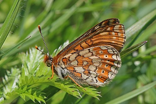
- High quality large image. FP on Commons. Male of same species showing wing upperside just promoted to FP on English Wikipedia.
- Articles in which this image appears
- Marsh fritillary
- FP category for this image
- lWikipedia:Featured pictures/Animals/Insects
- Creator
- Charlesjsharp
- Support as nominator – Charlesjsharp (talk) 18:09, 18 November 2018 (UTC)
- Support. MER-C 18:38, 18 November 2018 (UTC)
- Support – Bammesk (talk) 19:30, 18 November 2018 (UTC)
- Support. Kaldari (talk) 04:44, 19 November 2018 (UTC)
- Support – Great detail, nice contrast. Sca (talk) 14:15, 19 November 2018 (UTC)
- Support – DreamSparrow Chat 16:03, 21 November 2018 (UTC)
Promoted File:Marsh fritillary (Euphydryas aurinia) female underside.jpg --Armbrust The Homunculus 21:29, 28 November 2018 (UTC)
