 | |
| Category | Sans-serif |
|---|---|
| Classification | Geometric |
| Designer(s) | Adrian Frutiger |
| Foundry | Linotype GmbH |
| Date released | 1988 |
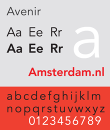
Avenir is a geometric sans-serif typeface designed by Adrian Frutiger in 1987[1] and released in 1988 by Linotype GmbH.
The word avenir is French for 'future'. As the name suggests, the family takes inspiration from the geometric style of sans-serif typeface developed in the 1920s that took the circle as a basis, such as Erbar and Futura. Frutiger intended Avenir to be a more organic interpretation of the geometric style, more even in colour and suitable for extended text, with details recalling more traditional typefaces such as the two-storey 'a' and 't' with a curl at the bottom, and letters such as the 'o' that are not exact, perfect circles but optically corrected.[1]
Frutiger described Avenir as his finest work: "The quality of the draftsmanship – rather than the intellectual idea behind it – is my masterpiece. (...) It was the hardest typeface I have worked on in my life. Working on it, I always had human nature in mind. And what's crucial is that I developed the typeface alone, in peace and quiet – no drafting assistants, no-one was there. My personality is stamped upon it. I'm proud that I was able to create Avenir."[2]
- ^ a b Frutiger, Adrian (2014). Typefaces: The Complete Works. Walter de Gruyter. p. 230. ISBN 9783038212607.
- ^ Adrian Frutiger, Typefaces. The Complete Works, (Basel: Birkhäuser Verlag, 2008), p337.