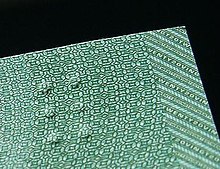

The Canadian currency tactile feature is a feature on the Canadian Journey and Frontier series of Canadian banknotes to aid people who are visually impaired to identify the notes. The feature indicates the banknote denomination in the upper left corner of the face side of the bill using a series of raised dots. It was suggested by Bruno Thériault, an administrator for the Canadian National Institute for the Blind,[1] and designed by Susan Lederman, a professor of psychology at Queen's University.[2][3]
Although similar in appearance to braille, it differs because standard Braille was deemed too sensitive. The currency denomination must be recognized easily, thus the banknotes use full braille blocks (or cells) of 6 dots, ⟨⠿⟩. The $5 bill has one cell, with the $10, $20, and $50 denominations each having one more cell than previous. The $100 bill has two cells arranged such that there is a space of two empty cells between them: ⟨⠿⠀⠀⠿⟩.[3][4]
A very similar system of tactile raised dots is now being implemented in a new series of notes for the Costa Rican colón.[citation needed]
The U.S. Treasury has announced that the new $10 note will also have a tactile feature.[5]
- ^ "Obituary of Bruno Theriault". yourfolks.com (in French and English). L'Acadie Nouvelle. 16 May 2005. Retrieved 4 January 2022.
As CNIB District Administrator, ....The Canadian Government is now able to print Canadian (paper) money with Braille writing due to a recommendation from Bruno in the 1990s.
- ^ Pedwell, Carolyn (2001-01-19). "Profs contributed to new $10 bill". Queen's Journal. Retrieved 2019-12-04.
- ^ a b Lederman, Susan J.; Hamilton, Cheryl (2002). "Using Tactile Features to Help Functionally Blind Individuals Denominate Banknotes". Human Factors: The Journal of the Human Factors and Ergonomics Society. 44 (3): 413–428. doi:10.1518/0018720024497646. ISSN 0018-7208. PMID 12502159. S2CID 22157965.
- ^ Samuel, Carolyn (Winter 2009–2010). "Making bank notes accessible for Canadians living with blindness or low vision" (PDF). Bank of Canada Review.
- ^ Wolff-Mann, Ethan (2015-10-15). "How Other Countries Help Blind People Tell a $1 from a $50". Money. Retrieved 2019-12-05.