 | |
| Category | Serif |
|---|---|
| Classification | Old-style |
| Designer(s) | William Caslon I |
| Foundry | Caslon Type Foundry |
| Variations | Many |
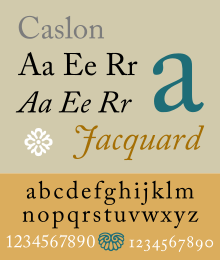
| Shown here | Adobe Caslon by Carol Twombly |
Caslon is the name given to serif typefaces designed by William Caslon I (c. 1692–1766) in London, or inspired by his work.
Caslon worked as an engraver of punches, the masters used to stamp the moulds or matrices used to cast metal type.[1][2][3] He worked in the tradition of what is now called old-style serif letter design, that produced letters with a relatively organic structure resembling handwriting with a pen. Caslon established a tradition of engraving type in London, which previously had not been common, and was influenced by the imported Dutch Baroque typefaces that were popular in England at the time.[4][5][6][7] His typefaces established a strong reputation for their quality and their attractive appearance, suitable for extended passages of text.[8][9]
The letterforms of Caslon's roman, or upright type include an "A" with a concave hollow at top left and a "G" without a downwards-pointing spur at bottom right. The sides of the "M" are straight.[10] The "W" has three terminals at the top and the "b" has a small tapered stroke ending at bottom left.[10] The "a" has a slight ball terminal.[11] Ascenders and descenders are relatively short and the level of stroke contrast is modest in body text sizes. In italic, Caslon's "h" folds inwards and the "A" is sharply slanted.[10] The "Q", "T", "v", "w" and "z" all have flourishes or swashes in the original design, something not all revivals follow.[10] The italic "J" has a crossbar, and a rotated casting was used by Caslon in many sizes on his specimens to form the pound sign.[3] However, Caslon created different designs of letters at different sizes: his larger sizes follow the lead of a type he sold cut in the previous century by Joseph Moxon, with more fine detail and sharper contrast in stroke weight, in the "Dutch taste" style.[12] Caslon's larger-size roman fonts have two serifs on the "C", while his smaller-size versions have one half-arrow serif only at top right.
Caslon's typefaces were popular in his lifetime and beyond, and after a brief period of eclipse in the early nineteenth century returned to popularity, particularly for setting printed body text and books. Many revivals exist, with varying faithfulness to Caslon's original design.[13] Modern Caslon revivals also often add features such as a matching boldface and "lining" numbers at the height of capital letters, neither of which were used in Caslon's time.[14][a] William Berkson, designer of a revival of Caslon, describes Caslon in body text as "comfortable and inviting".[15]
- ^ Mosley, James (1967). "The Early Career of William Caslon". Journal of the Printing Historical Society: 66–81.
- ^ Carter, Harry (1965). "Caslon Punches: An Interim Note". Journal of the Printing Historical Society. 3: 68–70.
- ^ a b Howes, Justin (2000). "Caslon's punches and matrices". Matrix. 20: 1–7.
- ^ Mosley, James (2008). "William Caslon the elder". Oxford Dictionary of National Biography.
- ^ Macmillan, Neil (2006). An A-Z of Type Designers. Yale University Press. pp. 63–4. ISBN 0-300-11151-7.
- ^ Loxley, Simon (12 June 2006). Type: The Secret History of Letters. I.B.Tauris. pp. 28–37. ISBN 978-1-84511-028-4.
- ^ Alexander S. Lawson (January 1990). Anatomy of a Typeface. David R. Godine Publisher. pp. 169–183. ISBN 978-0-87923-333-4.
- ^ Dodson, Alan. "A Type for All Seasons". Matrix. 12: 1–10.
- ^ Dodson, Alan (2003). "Caslon- a Lively Survival". Matrix: 62–71.
- ^ a b c d Tracy, Walter (January 2003). Letters of Credit: A View of Type Design. D.R. Godine. pp. 56–59. ISBN 978-1-56792-240-0.
- ^ "John Lane & Mathieu Lommen: ATypI Amsterdam Presentation". YouTube. ATypI. Archived from the original on 2021-12-21. Retrieved 12 July 2019.
- ^ Carter, Harry (1937). "Optical scale in type founding". Typography. 4. Archived from the original on 8 March 2021. Retrieved 15 September 2019.
- ^ Paul Shaw (April 2017). Revival Type: Digital Typefaces Inspired by the Past. Yale University Press. pp. 79–84. ISBN 978-0-300-21929-6.
- ^ Haley, Allan. "Bold type in text". Monotype. Retrieved 11 August 2015.
- ^ Cite error: The named reference
Berkson 2was invoked but never defined (see the help page).
Cite error: There are <ref group=lower-alpha> tags or {{efn}} templates on this page, but the references will not show without a {{reflist|group=lower-alpha}} template or {{notelist}} template (see the help page).