 | |
| Category | Serif |
|---|---|
| Classification | Old-style, Venetian |
| Designer(s) | Bruce Rogers Frederic Warde Nicolas Jenson Ludovico Vicentino degli Arrighi |
| Foundry | Monotype Corporation |
| Date created | 1914 |
| Date released | 1929 |
| Also known as | Metropolitan |
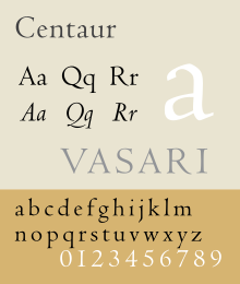
Centaur is a serif typeface by book and typeface designer Bruce Rogers, based on the Renaissance-period printing of Nicolas Jenson around 1470.[1] He used it for his design of the Oxford Lectern Bible. It was given widespread release by the British branch of Monotype, paired with an italic designed by calligrapher Frederic Warde and based on the slightly later work of calligrapher and printer Ludovico Vicentino degli Arrighi. The italic has sometimes been named separately as the "Arrighi" italic.
Centaur is an elegant and quite slender design, lighter on the page than Jenson's work and most other revivals, an effect possibly amplified in the digital release compared to the metal type.[1] It has been popular in fine book printing and is often used both for printing body text and especially titles and headings.[2] One of its most notable uses has been in the designs of Penguin Books, who have regularly used it for titling.[3]
- ^ a b Heller, Steven (13 September 2016). "The Rise of Centaur". Print. Retrieved 23 September 2016.
- ^ Shaw, Paul. "Book Review: Type Revivals". Blue Pencil. Retrieved 19 September 2015.
- ^ Doubleday, Richard. "Jan Tschichold at Penguin Books: A Resurgance(sic) of Classical Book Design" (PDF). Retrieved 30 June 2015.