 | |
| Category | Serif |
|---|---|
| Classification | Slab serif |
| Designer(s) | Robert Besley |
| Foundry | Fann Street (Show all characters) |
| Date released | 1845 |
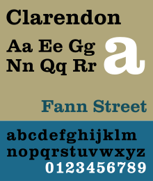
Clarendon is the name of a slab serif typeface that was released in 1845 by Thorowgood and Co. (or Thorowgood and Besley) of London, a letter foundry often known as the Fann Street Foundry. The original Clarendon design is credited to Robert Besley, a partner in the foundry, and was originally engraved by punchcutter Benjamin Fox, who may also have contributed to its design.[1][2] Many copies, adaptations and revivals have been released, becoming almost an entire genre of type design.
Clarendon has a bold, solid structure, similar in letter structure to the "modern" serif typefaces popular in the nineteenth century for body text (for instance showing an 'R' with a curled leg, and ball terminals on the 'a' and 'c'), but bolder and with less contrast in stroke weight.[3][4][5][6] Clarendon designs generally have a structure with bracketed serifs, which become larger as they reach the main stroke of the letter. Mitja Miklavčič describes the basic features of Clarendon designs (and ones labelled Ionic, often quite similar) as: "plain and sturdy nature, strong bracketed serifs, vertical stress, large x-height, short ascenders and descenders, typeface with little contrast" and supports Nicolete Gray's description of them as a "cross between the roman [general-purpose body text type] and slab serif model". Gray notes that nineteenth-century Ionic and Clarendon faces have "a definite differentiation between the thick and the thin strokes", unlike some other more geometric slab serifs.[7]
Slab serif typefaces had become popular in British lettering and printing over the previous thirty-five years before the original Clarendon's release, both for display use on signage, architectural lettering and posters and for emphasis within a block of text.[8] The Clarendon design was immediately very popular and was rapidly copied by other foundries to become in effect an entire genre of type design. Clarendon fonts proved extremely popular in many parts of the world, in particular for display applications such as posters printed with wood type. They are therefore commonly associated with wanted posters and the American Old West.[9][10] A revival of interest took place in the post-war period: Jonathan Hoefler comments that "some of the best and most significant Clarendons are twentieth century designs" and highlights the Haas and Stempel foundry's bold, wide Clarendon display face as "a classic that for many people is the epitome of the Clarendon style."[4][1]
- ^ a b Alexander S. Lawson (January 1990). Anatomy of a Typeface. David R. Godine Publisher. pp. 314–5. ISBN 978-0-87923-333-4.
- ^ Twyman, Michael. "The Bold Idea: The Use of Bold-looking Types in the Nineteenth Century". Journal of the Printing Historical Society. 22 (107–143).
- ^ Mosley, James. "Comments on Typophile thread "Where do bold typefaces come from?"". Typophile. Archived from the original on 20 December 2016. Retrieved 16 December 2016.
For the record, the Clarendon type of the Besley foundry is indeed the first type actually designed as a 'related bold' – that is, made to harmonize in design and align with the roman types it was set with. It was registered in Britain in 1845...but the idea of a 'bold face' goes back much further. Before the launch of Clarendon type printers picked out words in slab-serifs or any other heavy type. In the 18th century they used 'English' or 'Old English' types, which is why they became known as 'black letter'. John Smith says in his Printer's grammar (London, 1755). 'Black Letter … is sometimes used … to serve for matter which the Author would particularly enforce to the reader.'
- ^ a b Cite error: The named reference
Sentinel: historywas invoked but never defined (see the help page). - ^ Reader in Applied Linguistics Vivian Cook; Vivian Cook; Des Ryan (15 July 2016). The Routledge Handbook of the English Writing System. Routledge. p. 443. ISBN 978-1-317-36581-5.
- ^ John L Walters (2 September 2013). Fifty Typefaces That Changed the World: Design Museum Fifty. Octopus. pp. 41–44. ISBN 978-1-84091-649-2.
- ^ Cite error: The named reference
Three chapters in the development of clarendon/ionic typefaceswas invoked but never defined (see the help page). - ^ Gray, Nicolete (1976). Nineteenth-century Ornamented Typefaces.
- ^ Dennis Ichiyama. "2004 Friends of St Bride conference proceedings: How wood type tamed the west". Stbride.org. Archived from the original on 2013-11-11. Retrieved 2013-11-11.
- ^ "Old West Reward Posters". Wildwestweb.net. Retrieved 2013-11-11.