 | |
| Category | Sans-serif |
|---|---|
| Designer(s) | Christian Boer |
| Foundry | Dyslexie font |
| Date created | 2008[1] |
| License | proprietary[2] |
| Variations | Dyslexie regular, bold, italic, italic bold |
| Website | www |
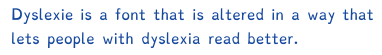
Dyslexie is a typeface/font that was designed with the intention of mitigating some of the issues that dyslexics experience when reading. As many of the twenty-six letters of the basic Latin alphabet are visually very similar, the typeface emphasizes the parts of the letter that are different from each other.[3]
There is no evidence that the font aids reading, neither in those with, nor without, dyslexia.[4]
- ^ Nalewicki, Jennifer (October 26, 2011). "Bold Stroke: New Font Helps Dyslexics Read". Scientific American.
- ^ "Order Dyslexie". Studiostudio.nl. Archived from the original on 2017-12-10. Retrieved December 15, 2012.
- ^ Sawers, Paul (30 June 2011). "Dyslexie: A typeface for dyslexics". Thenextweb.com. Retrieved April 9, 2012.
- ^ Kuster, Sanne M.; van Weerdenburg, Marjolijn; Gompel, Marjolein; Bosman, Anna M. T. (April 2018). "Dyslexie font does not benefit reading in children with or without dyslexia". Annals of Dyslexia. 68 (1): 25–42. doi:10.1007/s11881-017-0154-6. ISSN 0736-9387. PMC 5934461. PMID 29204931.