 | |
| Category | Sans-serif |
|---|---|
| Classification | Humanist |
| Designer(s) | Adrian Frutiger |
| Foundry | Linotype |
| Date released | 1976[1] |
| License | Commercial[2] |
| Variations | Frutiger Next |
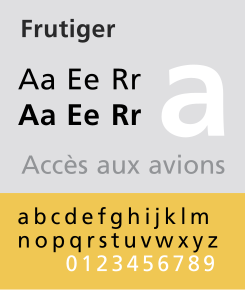
Frutiger (pronounced [ˈfruːtɪɡər]) is a series of typefaces named after its Swiss designer, Adrian Frutiger.[3] Frutiger is a humanist sans-serif typeface, intended to be clear and highly legible at a distance or at small text sizes. A popular design worldwide, type designer Steve Matteson described its structure as "the best choice for legibility in pretty much any situation" at small text sizes, while Erik Spiekermann named it as "the best general typeface ever".[4][5]
- ^ Frutiger, Adrian. Typefaces: The Complete Works. pp. 24, 251.
- ^ "Monotype Introduces Mosaic Platform Enhancements and Neue Frutiger World Typeface for Global Branding; Plans Font Discovery Technology Preview for Adobe MAX". Businesswire. 10 October 2018. Retrieved 2019-05-19.
- ^ Kupferschmid, Indra (16 March 2015). "Between Frutigerization and tradition: diversity, standardization, and readability in contemporary typographic landscapes". Social Semiotics. 25 (2): 151–164. doi:10.1080/10350330.2015.1010319. S2CID 145113756.
- ^ Spiekermann, Erik. "Twitter post". Twitter. Retrieved 2015-07-11.
- ^ Matteson, Steve. "Type Q&A: Steve Matteson from Monotype". Typecast. Retrieved 2015-09-12.