 | |
| Category | Serif |
|---|---|
| Classification | Old-style |
| Designer(s) | Robert Granjon Matthew Carter |
| Foundry | Linotype International Typeface Corporation |
| Date released | 1978 |
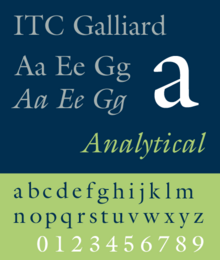
ITC Galliard is the name of a serif typeface designed by Matthew Carter and issued in 1978 by the Mergenthaler Linotype Company.[1]
Galliard is based on the sixteenth-century type of Robert Granjon.[2] According to Alexander Lawson, "The name Galliard stems from Granjon's own term for an 8-point font he cut about 1570. It undoubtedly refers to the style of the face, for the galliard was a lively dance of the period."[3] Explaining what drew him to Granjon's work, Carter wrote on some of his more characteristic letterforms: "looking at them, adjectives like 'spirited, 'tense' and 'vigorous' come to mind...it is easy to admire Granjon's work."[1]
Mike Parker, Director of Typographic Development at Mergenthaler Linotype, had been inspired by seeing the types of Granjon at the Plantin-Moretus Museum in Antwerp.[4][3] Matthew Carter, who joined Mergenthaler Linotype as a typeface designer in 1965, was also an admirer. His father, Harry Carter, had worked to itemise the museum's extensive collection of sixteenth-century punches and matrices in the 1950s, with his son occasionally helping.[5][6][7][8] Work continued on the typeface, sporadically, through the 1960s and 1970s. The typeface was released in 1978. With a glittering, crisp design, Galliard has been used both for body text and for headings. Galliard is notable for its 'pelican-beak' letter 'g', based on Granjon's Double Pica italic of 1570.[2]
- ^ a b Carter, Matthew (1985). "Galliard: A Revival of Types of Robert Granjon". Visible Language. 19 (1): 77–98. Archived from the original on 30 December 2017. Retrieved 19 May 2017.
- ^ a b Vervliet, Hendrik D.L. (2008). The Palaeotypography of the French Renaissance: Selected papers on sixteenth-century typefaces. 2 vols. Leiden: Koninklijke Brill NV. pp. 215–230, 321–2, 356. ISBN 9789004169821.
- ^ a b Lawson, Alexander, Anatomy of a Typeface, Godine, 1990.
- ^ Bigelow, Charles, Galliard in Fine Print on Type, Charles Bigelow, editor, 1989.
- ^ "ITC Classics: ITC Galliard - ITCFonts.com". Archived from the original on 2012-06-20. Retrieved 2012-06-20.
- ^ Carter, Harry (2002). Mosley, James (ed.). A View of Early Typography up to about 1600. London: Hyphen Press.
In 1954 Carter was persuaded...to take up the appointment of Archivist at the Oxford University Press...a part of Carter's brief was therefore to look into [the Plantin-Moretus Museum's] collections...it had gradually become known that Plantin's stock of punches and matrices had also survived intact...Carter became a member of the small team of researchers who performed the task of sorting and cataloguing the materials...his experience at Antwerp involved handling punches...and original matrices, from which he cast sample types, using the traditional hand mould.
- ^ Hoefler, Jonathan. "Reconstructing Harry". Hoefler & Co. Retrieved 14 October 2017.
- ^ Mosley, James (2003). "Reviving the Classics: Matthew Carter and the Interpretation of Historical Models". In Re, Margaret (ed.). Typographically Speaking: The Art of Matthew Carter (2. ed.). New York: Princeton Architectural. pp. 31–6. ISBN 9781568984278.