 | |
| Category | Sans-serif |
|---|---|
| Classification | Grotesque |
| Designer(s) | Mike Abbink Paul van der Laan Pieter van Rosmalen |
| Foundry | IBM Bold Monday |
| License | SIL OFL |
| Latest release version | 3.5 |
| Latest release date | 20 September 2023 |
 | |
| Category | Sans-serif |
|---|---|
| Classification | Grotesque |
| Designer(s) | Mike Abbink Paul van der Laan Pieter van Rosmalen |
| Foundry | IBM Bold Monday |
| License | SIL OFL |
| Latest release version | 1.4 |
| Latest release date | 28 July 2022 |
 | |
| Category | Monospaced |
|---|---|
| Designer(s) | Mike Abbink Paul van der Laan Pieter van Rosmalen |
| Foundry | IBM Bold Monday |
| License | SIL OFL |
| Latest release version | 2.4 |
| Latest release date | 21 December 2023 |
 | |
| Category | Serif |
|---|---|
| Classification | Transitional |
| Designer(s) | Mike Abbink Paul van der Laan Pieter van Rosmalen |
| Foundry | IBM Bold Monday |
| License | SIL OFL |
| Latest release version | 3.1 |
| Latest release date | 27 November 2023 |
IBM Plex is an open source typeface superfamily conceptually designed and developed by Mike Abbink at IBM in collaboration with Bold Monday to reflect the design principles of IBM and to be used for all brand material across the company internationally. Plex replaces Helvetica as the IBM corporate typeface after more than fifty years, freeing the company from extensive license payments in the process.[1]
Version 1.0 of the font family had four typefaces, each with eight weights (Thin, Extra Light, Light, Regular, Text, Medium, Semi-bold, Bold) and true italics to complement them.[2]
- IBM Plex Sans – A grotesque sans-serif typeface with a design that was inspired by Franklin Gothic. Other sans-serif classifications were rejected on the basis of being too soft (humanist), inefficient (geometric) and overly perfected (neo-grotesque). Some of Franklin Gothic's features such as the angled terminals, a double-storey g and a horizontal line at the baseline of the 1 are used in IBM Plex Sans. On 7 April 2019, IBM Plex Sans Variable, a variable counterpart to IBM Plex Sans was released.
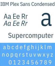
- IBM Plex Sans Condensed – A condensed variant of IBM Plex Sans.
- IBM Plex Mono – A monospaced typeface based on IBM Plex Sans. The italic design was inspired by the Italic 12 typeface used on the IBM Selectric typewriter; this is particularly evident with the italicised
i,j,tandxletters. - IBM Plex Serif – A transitional serif typeface with a design that was inspired by Bodoni and Janson. Other serif classifications were rejected for being too humanist and outdated (old-style) and too clunky and unrefined for long text (slab-serif). Some of Bodoni's features such as ball terminals and rectangular serifs are used in IBM Plex Serif.
- ^ Quito, Anne (10 November 2017). "IBM has freed itself from the tyranny of Helvetica". Quartz. Retrieved 14 November 2017.
- ^ "IBM Plex - 03 Plexness". IBM. Retrieved 14 August 2018.