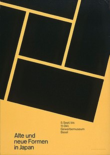
The International Typographic Style is a systemic approach to graphic design that emerged during the 1930s–1950s but continued to develop internationally. It is considered the basis of the Swiss style.[1][2] It expanded on and formalized the modernist typographic innovations of the 1920s that emerged in part out of art movements such as Constructivism (Russia), De Stijl (The Netherlands) and at the Bauhaus (Germany).[3] The International Typographic Style has had profound influence on graphic design as a part of the modernist movement, impacting many design-related fields including architecture and art. It emphasizes simplicity, clarity, readability, and objectivity.[4] Hallmarks of the style are asymmetric layouts, use of a grid, sans-serif typefaces like Akzidenz Grotesk and Helvetica, and flush left, ragged right text. The style is also associated with a preference for photography in place of illustrations or drawings. Many of the early International Typographic Style works featured typography as a primary design element in addition to its use in text, and it is for this that the style is named.[5][6] The influences of this graphic movement can still be seen in design strategy and theory to this day.
- ^ Vasileva E. (2021) The Swiss Style: It’s Prototypes, Origins and the Regulation Problem // Terra Artis. Arts and Design, 3, 84–101.
- ^ Hollis R. Swiss Graphic Design: The Origins and Growth of an International Style, 1920–1965. New Haven: Yale University Press: 2001.
- ^ "Lessons From Swiss Style Graphic Design – Smashing Magazine". Smashing Magazine. 17 July 2009. Retrieved 2015-12-11.
- ^ Encyclopædia Britannica, International Typographic Style
- ^ Encyclopædia Britannica, Arts & Entertainment: graphic design, THE INTERNATIONAL TYPOGRAPHIC STYLE
- ^ "International Poster Gallery". Archived from the original on 2008-05-12. Retrieved 2008-04-23.