This article needs additional citations for verification. (December 2009) |
 | |
| Category | Serif |
|---|---|
| Classification | Slab serif |
| Foundry | Monotype |
| Date released | 1934 |
| Design based on | Stymie Venus Egyptienne |
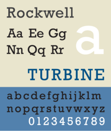
Rockwell is a slab serif typeface designed by the Monotype Corporation and released in 1934.[1][2] The project was supervised by Monotype's engineering manager Frank Hinman Pierpont. This typeface is distinguished by a serif at the apex of the uppercase A, while the lowercase a has two storeys. Because of its monoweighted stroke (meaning there is virtually no visible thick/thin transition in the strokes, so the letterforms are the same thickness all the way around),[3] Rockwell is used primarily for display or at small sizes rather than as a body text. Rockwell is based on an earlier, more condensed slab serif design cast by the Inland Type Foundry called Litho Antique.
Rockwell is a geometric slab-serif with a monoline construction, with all of its strokes appearing to be roughly the same width and its capital O roughly circular. This gives it a similar impression to common sans-serif designs of the period like Akzidenz Grotesk, Franklin Gothic, or Futura.[4] Rockwell is influenced by a style of geometric slab serif that had become popular around the time, including the earlier Memphis and Beton, and less similarly Stymie and City.[5]
Rockwell has remained popular and been digitised, although a shadowed weight has not been.
Bitstream offers a lookalike/clone of Rockwell, under the name Geometric Slabserif 712.[6]
Vernon Adams designed the Rokkitt typeface, inspired by Rockwell.[7][8]
- ^ W. Pincus Jaspert; W. Turner Berry; A.F. Johnson (1970) [1953]. Encyclopaedia of Type Faces (4th ed.). London: Blandford Press. p. 194. ISBN 0-7137-0191-9.
- ^ Lucienne Roberts (1 November 2005). Drip-dry Shirts: The Evolution of the Graphic Designer. AVA Publishing. p. 32. ISBN 978-2-940373-08-6.
- ^ "Type Styles". www.multimedia502.com. Retrieved 2023-12-23.
- ^ "Sentinel: historical background". Hoefler & Frere-Jones. Retrieved 15 July 2015.
- ^ Tam, Keith. "The revival of slab-serif typefaces in the 20th century" (PDF). University of Reading (MA thesis). Retrieved 3 March 2016.
- ^ "Geometric Slabserif 712 - Webfont & Desktop font « MyFonts". www.myfonts.com. Retrieved 3 March 2019.
- ^ "Rokkitt - Google Fonts". fonts.google.com. Retrieved 12 May 2020.
- ^ "Rokkitt typeface". Font Squirrel. Retrieved 18 November 2020.