 | |
| Category | Sans-serif |
|---|---|
| Classification | Humanist |
| Designer(s) | Luc(as) de Groot |
| Foundry | FontFabrik |
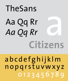
Thesis is a large typeface family designed by Luc(as) de Groot. The typefaces were designed between 1994 and 1999 to provide a modern humanist family. Each typeface is available in a variety of weights as well as in italic. Originally released by FontFont in 1994, it has been sold by de Groot through his imprint LucasFonts since 2000.[1][2]
Thesis fonts have become popular and can be seen in various publications or logotypes.
To create a varied range of fonts of different thicknesses and levels of condensation, Thesis was developed using multiple master technology, in which weights were created by 'averaging' and extending the trend between a thick and thin design to create a smooth, continuous trend in styles from thin to very bold. The fonts also include a large number of stylistic alternate characters.[3]
The family is a font superfamily, since it includes both serif and sans-serif designs.
- ^ "About Thesis". LucasFonts. Retrieved 27 March 2023.
- ^ Ulrich, Ferdinand. "From Compressed Light to Extended Ultra". FontShop. Retrieved 19 August 2017.
- ^ Hardwig, Florian. "Jazz In Town poster". Fonts In Use. Retrieved 12 May 2016.
TheSans is a well-equipped font, featuring Ǖ, Ǘ, Ǚ and Ǜ, Vietnamese small-caps, six alternative ampersands and many more cool extras.