 Visual aids Visual aids
|
||
|---|---|---|
| A subpage for a department of the U.S. Roads WikiProject | ||
All charts, graphs, and maps useful for understanding the current state of the project.
-
Map of featured articles
-
Map of upper-half articles
-
Map of upper-half articles (Northeast region)
-
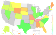
Map of states shaded by Ω
-
Alternate map with shading from 5.0 to 6.0.
-
Alternate map with shading from 4.0 to 5.0.
-
Alternate map with shading from 3.0 to 4.0.
-
Alternate map with shading from 2.0 to 3.0.
-
Alternate map with shading from 1.0 to 2.0.
-
Map of states shaded by number of stubs
-
Map of states shaded by their highest-assessed article
Pie graph of article quality
- FA: 84 (0.7%)
- A: 21 (0.2%)
- GA: 1,183 (9.5%)
- B: 1,583 (12.8%)
- C: 3,762 (30.3%)
- Start: 4,458 (35.9%)
- Stub: 1,324 (10.7%)
- Unassessed: 0 (0.0%)
Stacked bar graph of article quality over time
2,500
5,000
7,500
10,000
12,500
15,000
2007
2008
2009
2010
2011
2012
2013
2014
2015
2016
2017
2018
2019
2020
2021
2022
Stacked bar graph of upper-half articles over time
500
1,000
1,500
2,000
2,500
3,000
2007
2008
2009
2010
2011
2012
2013
2014
2015
2016
2017
2018
2019
2020
2021
2022
ω over time
10,000
20,000
30,000
40,000
50,000
60,000
2007
2008
2009
2010
2011
2012
2013
2014
2015
2016
2017
2018
2019
2020
2021
Ω over time
1
2
3
4
5
6
2007
2008
2009
2010
2011
2012
2013
2014
2015
2016
2017
2019
2019
2020
2021


