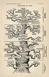
I don't think this article should lead with a picture of Darwin, because the Featured Picture will be a Darwin portrait. I much prefer the tree at the beginning of the article. Darwin's iconic tree sketch would be okay too. If we are going to use a photo, I suggest this one File:Darwin - John G Murdoch Portrait restored.jpg.--ragesoss (talk) 18:16, 6 February 2009 (UTC)
- At 100 pixels wide, you can't tell what either of those pictures are:
- Do you disagree? If not, can you suggest something that will look OK at 100 pixels? Raul654 (talk) 20:24, 8 February 2009 (UTC)
- I think a contrast-enhanced version of the tree sketch, or maybe an isolated version with just the tree, would be recognizable. But if we do stick with a photo of Darwin, what about the alternative I suggested? Another possibility would be to concatenate the two peppered moth photos.--ragesoss (talk) 22:00, 8 February 2009 (UTC)
- We shouldn't have the same pic of Darwin on the main page twice. That would be silly. So either picture for the FA changes or featured pic does.
- I'm not sure what you mean by "an isolated version with just the tree". Can you please give a few more details?
- Another possibility would be to concatenate the two peppered moth photos. - meh. If like the vast majority of people, you don't already know why peppered moths are significant where evolution is concerned, the photos won't be of much value. Raul654 (talk) 22:32, 8 February 2009 (UTC)
- It's not the same photo. The FP is File:Darwin restored2.jpg.--ragesoss (talk) 22:50, 8 February 2009 (UTC)
- OK, even if it's not the exact same photo, that would still be a bit strange. I'm about to go traveling (so my internet access will be slow if not nonexistant), so I'll switch it to the tree. But I'm not thrilled by it and if someone wants to replace it with a better one, I'd be grateful. Raul654 (talk) 19:51, 10 February 2009 (UTC)
- It's not the same photo. The FP is File:Darwin restored2.jpg.--ragesoss (talk) 22:50, 8 February 2009 (UTC)
- I think a contrast-enhanced version of the tree sketch, or maybe an isolated version with just the tree, would be recognizable. But if we do stick with a photo of Darwin, what about the alternative I suggested? Another possibility would be to concatenate the two peppered moth photos.--ragesoss (talk) 22:00, 8 February 2009 (UTC)
Thought –
 . Also available without text and transparent background, could add black: File:Primate skull series.png . dave souza, talk 20:00, 10 February 2009 (UTC)
Or, corny as it is,
 . The tree of life is a good idea, but at that size it's a problem and Darwin's sketch only makes sense if you know about it. I think. . dave souza, talk 20:13, 10 February 2009 (UTC)
- Both of these are better options. Raul654 (talk) 20:24, 10 February 2009 (UTC)
- I like the idea of using the ape-to-upright-man icon. Do you we have a good uncomplicated historical one? (Maybe Huxley's skeletons?) The skulls on black would also work better than the tree, I think.--ragesoss (talk) 20:25, 10 February 2009 (UTC)
- Ugh. I really dislike the outline image. I know the article is about the history of evolution, but that image is really very misleading on many levels. Tim Vickers (talk) 00:16, 12 February 2009 (UTC)
- Could we use this modified skull image? Tim Vickers (talk) 00:24, 12 February 2009 (UTC)


