This article needs additional citations for verification. (June 2011) |


10 year minus 2 year treasury yield
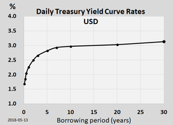
In finance, the yield curve is a graph which depicts how the yields on debt instruments – such as bonds – vary as a function of their years remaining to maturity.[1][2] Typically, the graph's horizontal or x-axis is a time line of months or years remaining to maturity, with the shortest maturity on the left and progressively longer time periods on the right. The vertical or y-axis depicts the annualized yield to maturity.[3]
Those who issue and trade in forms of debt, such as loans and bonds, use yield curves to determine their value.[4] Shifts in the shape and slope of the yield curve are thought to be related to investor expectations for the economy and interest rates.
Ronald Melicher and Merle Welshans have identified several characteristics of a properly constructed yield curve. It should be based on a set of securities which have differing lengths of time to maturity, and all yields should be calculated as of the same point in time. All securities measured in the yield curve should have similar credit ratings, to screen out the effect of yield differentials caused by credit risk.[5] For this reason, many traders closely watch the yield curve for U.S. Treasury debt securities, which are considered to be risk-free. Informally called "the Treasury yield curve", it is commonly plotted on a graph such as the one on the right.[6] More formal mathematical descriptions of this relationship are often called the term structure of interest rates.
- ^ Fabozzi, Frank J. (1996). Bond Markets, Analysis and Strategy (Third ed.). Upper Saddle River, NJ: Prentice-Hall, Inc. p. 85. ISBN 0-13-339151-5.
- ^ Yield Curve 101: The Ultimate Guide for ETF Investors – Yahoo Finance Yahoo Finance
- ^ Fabozzi op cit p. 86.
- ^ Fabozzi op cit p. 87.
- ^ Melicher, Ronald and Welshans, Merle (1988). Finance: Introduction to Markets, Institutions and Management (7th ed.). Cincinnati: South-Western Publishing. pp. 490–491. ISBN 0-538-06160-X.
{{cite book}}: CS1 maint: multiple names: authors list (link) - ^ Phillips, Matt (25 June 2018). "What's the Yield Curve? 'A Powerful Signal of Recessions' Has Wall Street's Attention". The New York Times.